review by Kathleen Loomis
(Note: The author had two quilts juried into the main Quilts for Change show.)
Judged by Carolyn Mazloomi (art) and Donna McDade (traditional)
Quilts for Change is a biennial, first held in 2004 and again this year. The sponsor is the Zonta Club of Cincinnati, a women’s service organization whose mission focuses on the elimination of violence against women. Although not a requirement for entry, the theme was featured prominently in publicizing the show. It attracted a significant number of quilts about women and abuse or self-esteem, along with other subjects of social protest such as guns and war — dark emotions rarely found at quilt shows but exciting to see here.
Although art quilts were the great majority of the 138 juried entries, three times as many prizes were given to traditional quilts. Despite its prevalence, none of the social-protest work received a prize. Prizes were awarded in three categories of traditional quilts (applique, pieced and other), but art quilts constituted a single category. It’s hard to know why the organizers decided upon this disproportionate allocation of prize money. The 2004 show was notable for the number and quality of art quilts, the show poster (by Susan Shie) was clearly an art quilt, and the lack of a minimum size for entries was art-quilt-friendly.
It was frustrating to try to understand the judges’ choices. Quilts were neither labeled nor grouped by categories, and in fact entrants did not even specify which category their quilts fell into. If you wanted to see, for instance, which quilts were judged against yours in the “traditional/ other” category, the only way was to walk around the exhibit, inspect each quilt and try to decide whether it fell into that category.
Two years ago show goers were frustrated by the hanging of the show – even the tiniest quilts were hung with their tops eight feet above the ground — and with the difficulty of finding their way around the show. If you saw a quilt described in the catalog and wanted to see it, there was no way to figure out where it was hung. And if you saw a quilt on the wall and wanted to read the statement, there was no way to find it in the catalog. This year saw great improvement on the first count, with small quilts (many entries were quite small) hung at eye level, but the catalog and exhibit map were still difficult to figure out.
Other than the many social-protest themed quilts, it was hard to spot any noteworthy trends – a refreshing change from some shows that inadvertently showcase quilt-fad-of-the-week. There seemed to be less embellishment on view than typically seen among art quilts, somewhat less use of phototransfer, hardly any Angelina fibers. The critical viewer could not but notice how many quilts on display lacked value contrast and seemed to have little thought for composition.
Quilts that caught my eye included Sandra Woock’s three whole-cloth works using the motif of the pointed crown on the Statue of Liberty.

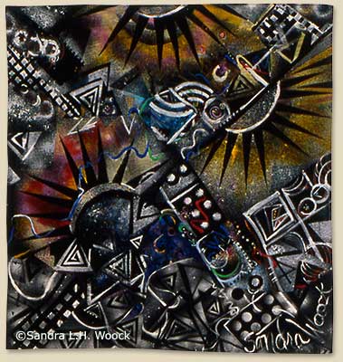

Sandra L.H. Woock: Lady Sings the Blues, Taking Liberties II, Taking Liberties
Shelley Baird’s twin quilts, “Bruises” and “Burns,” were striking for their sound composition and the contrast of pretty colors with disturbing photos and text about abused women.


Shelly Baird: Burns, Bruises
Ellen Zak Danforth had a new and pleasant twist on the old-necktie quilt, with pairs of unmatched tie ends emerging from the pieced surface to be looped or tied together.
Two special traveling exhibits were on display. Artquilts Images, a juried show from PAQA South, showed photo images in quilts. The 26 works had a wide range of approaches to photos, from actual paper photographs to many different ways of transferring images to fabric. Artistically, the exhibit was a success, with several striking quilts. Especially pleasing were Cheryl Lynch’s small 3-D quilt of Christo’s gates, with orange fabric billowing out from a pale gray-tone photo of Central Park, and Janine LeBlanc’s antiwar quilt with a long yellow ribbon, “bloodstained” with red hand stitching, trailing onto the floor.

Janine LeBlanc: Yellow Ribbon
Visual Voice, a show curated by Keisha Roberts, was less successful. From the impenetrable explanatory text (“artists interrogate silence”) it was difficult to figure out the unifying theme behind the exhibit. Some of the text seemed to imply the use of text or communication; some pointed toward cultural and national identity. The 37 quilts were all over the lot and the exhibit would have been far more satisfying at half the size.
In particular, one artist, Karina Abdusamad, had nine works in the show! Two were striking, panels of many different white fabrics in decreasing size, each fabric with a hole in it. The works showed up particularly well against the black drapes of the show (by contrast, many black quilts in the show almost disappeared into the drapery). But Abdusamad’s other quilts appeared to be early work, heavy-handed in its ethnic imagery and technically disappointing. They should have been left at home.
The exhibit also included five of Angela Moll’s “Secret Diary” quilts. Each one is a masterpiece, with its almost-readable handwritten text hinting at the writer’s fraught life, but one or two would have been even more exciting than all five. Other quilts in the exhibit showed a puzzling juxtaposition of Afro-ethnic themes and fabrics, beaded works, and handsome abstractions, both pieced and dyed.
Although the show had all the amenities a visitor could want – convenient parking, comfortable classrooms, wide aisles, good lighting, cheerful attendants, scads of door prizes — there were unhappily very few people in attendance. Vendors were disappointed if not overly rebellious over the low turnout, and several workshops had to be cancelled for insufficient registration. Apparently the workshops were not advertised at all in print media, and the newspaper ad on the last day of the show gave incorrect hours. Exhibitors were given two free tickets to give to friends, but not told that the tickets were going to be available until they showed up (friendless) at the door. A lot of wrinkles still need to be ironed out if the third show is to be a success.

Shelley Baird is an artist to watch — her work is superb. Thanks for this excellent review on both exhibits.
My quilts just came back from Quilts for Change.
I’m not sure how successful a show (if the goal is to raise MONEY for the group’s efforts) would be if it focused on quilts with dark social commentary. Perhaps it’s a choice or focus that the group will have to refine in the future, in terms of attracting both quilts and viewers.
As an exhibitor I did choose my category when entering and I did know that there were tickets available for me and a friend at the door. Also, the signage that was returned with my quilt had the quilt title, my name and the statement I had provided. I’m not sure what was in the catalog beyond that.
Thanks for the review. They did not even pack a catalogue with my returned quilts. Unless they change their direction, I will not be submitting again. It takes a lot of resources (time, $$$, emotion) to make a theme art quilt for this cause. If their mission is to promote a cause, simply asking for my money would have been less costly.
As someone who hung quilts for the show (including the Shelley Baird quilts which were quite well done and thought provoking), notice of the improvements in the hanging of the quilts is appreciated. We were told a number of times that the quilts were hung too high the first year and to hang them at eye level.
I wondered about the groupings myself, but don’t know how that whole process evolved.
I also heard the complaints about attendance. I have some thoughts that I hope to share with people about getting more involved with local groups, but what you’ve mentioned about recognition for art quilts is troubling. Hopefully this review will be forwarded to people connected with organizing the show.
I rather enjoyed Quilts for Change. I appreciated a great deal of work in the larger exhibition. And I really liked Images, although I didn’t quite get the connection to the Quilts for Change theme. Several of the quilts were very powerful, like LeBlanc’s as you mentioned. I thought Visual Voice was the most thought provoking show there. The quilts had plenty of breathing room between them. It felt like being in a gallery instead of a run-of-the-mill art quilt show where quilts are practically hung on top of each other. I’ll agree. It was out of place. It should have been at a museum, not a quilt show.
Ms. Loomis, I’d love to know what “ethnic” means when you say “heavy-handed in its ethnic imagery”. Was the quilt too Scandinavian? Was it too Irish? What exactly was it too much of? Please, enlighten me. I’d love to understand exactly what you’re saying here.
Ms. Loomis, I’m also curious about the “puzzling juxtaposition of Afro-ethnic themes and fabrics” you mention. I wonder… did you walk through the rest of the show and say, “Gee, what a puzzling juxtaposition of Euro-ethnic fabrics and imagery”? Or “Gee, there are too many quilts that look like they were made by white people here”? I bet not! Makes me embarrassed to be white. (Scottish parents actually… which is an ethnicity too.)
Why go to an exhibit if you don’t plan to think? Do you need an essay beside each quilt to understand what it means? Do the artists have to connect the dots for you? I got something I don’t normally get at art quilt shows–something to THINK about.
I am a sculptor and quilts are my hobby. I notice that art quilters want to be taken seriously as artists, but somehow can’t adapt to the art arena. It should be thought provoking. You should have to think for yourself to interpret art. Why would we take art quilts seriously when you pander to audiences (and reviewers) who want to go to the county fair to see a bunch of “technically successful” bedspreads with perfect little stitches? Why would we take art quilts seriously if even art quilters don’t interpret them as art?
Perhaps, Ms. Loomis, you should have left your racist assumptions and pattern-maker standards at home.
And by the way, diptychs count as 1 work, not 2. Triptychs are 1, not 3. Lord!
I was a vendor at this show and came up from Florida with great hopes of success. Vendors had been told attendance would be around 5,000. True attendance was less than 1,200 and I would guess 30-40% of those were NOT quilters. This meant the chances for making money were slim. Add to this the high cost of a single booth ($500 + utilities) and you can see why vendors were very, very upset. I lost money and cannot see myself ever returning – though I would love to as I spent a year attending Xavier U. (home of the Cintas Center).
My belief is that the Zonta organization does not understand quilters or quilt shows and the vendors upon whom they want to eaqrn revenue . I saw no evidence they had any quilt guilds working with them to improve attendance. It is a shame as their up front organization was wonderful.
I too was attracted by Susan Shie’s artwork – I assumed that there would be at least an equal mix of art and tradtional quilts.
Did anyone happen to see my peice “Pathway No.5”?
Karen Loprete
I feel I must reply to Karen H’s comment above where she states:
>
Of course you are right about this, but no where in the Loomis review do I see any mention of diptychs or triptychs and can only assume that you are referring to the photos included of Sandra Woock’s 3 pieces and Shelly Baird’s 2 pieces. All five of these works are stand-alone work, though they do bear strong relationships to each other through techniques and theme. Because they are also separately titled, I see them as being from a series, not part of a diptych or triptych. Sandra Woock’s website shows her three pieces on this page: http://www.sandrawoock.com/pages/gallery2.html, as part of a related series. I am currently unable to locate a website for Shelley Baird.
Perhaps you should write your own opposing review and submit it to ArtQuiltReviews and share the points that gave you “something to THINK about”. Please see the submission guides at the top of the page. Sandy Donabed
Dear Sandy Donabed,
Thank you for pointing me to the submission guidelines. After I read the above review, I wondered about the submission criteria.
I don’t think writing a review would be productive. I felt personally very disappointed that you responded to the most insignificant point of my post.
What about the “thinking” questions I already laid on the table?
1.) What is the reviewer talking about when she uses the word “ethnic”? If a quilt had been appliqued to death with Celtic knots, would it have been too “heavy-handed in its ethnic imagery”? Would there have then been a “puzzling juxtaposition of Indo-European themes”?
2.) Why were Abdusamad’s quilts “technically disappointing”? Why did it look like “early work”? Because she didn’t hand quilt 8-12 stitches per inch? I interpreted the stitches as a conscious aesthetic choice, not a lack of technical skill. What’s behind the reviewer’s assumptions that she interpreted it as anything other than artistic license?
There’s plenty here for a hearty discussion without a separate review, but I don’t expect any thoughts on the questions I posed. Look, I’m not trying to be mean-spirited here. I just see a glaring lack of depth of inquiry and I’m challenging that. I don’t see this questioning happening anywhere in quilt world and these assumptions are nearly everywhere in this circle. It’s frustrating, insincere and superficial. Makes me want another hobby… maybe gardening.
Karen, not having seen the work in this show it is not possible for me to comment on your 2 “thinking” questions specifically in regards to Abdusamad’s work.
Although I will address point #2 in general with no specific piece of artwork in mind.
I have seen many fiber pieces where the maker has used loose stitching, or other techniques such as dangling threads, that could be interpretted as either a technically poor work or as artistic license. But more often than not I find myself seeing it as a lack of command of the medium. Using loose or large stitching is wonderful if the rest of the piece supports this style of work. But very often I see it being done for no apparent reason as it is not well integrated into the work. As a result the piece just looks sloppy. The intent might have been artistic license but if it is not done well the piece is not successful.
And in fact I find this to be an ever growing trend in art quilting, to add in random touches of different techniques with no clear purpose in mind. Playing with a technique and mastering a technique and successfully integrating it into the whole are 2 different things. It’s not a question of 8-12 beautiful stitches per inch or perfect binding – it’s a question of a successful unified piece of artwork.
Whether or not the pieces in this show successfully used this technique is not for me to say as I am unfamiliar with the work.
As Ms. Donabed has pointed out you are welcome to submit your own review of the show if you feel this one was inaccurate in evaluating the intention of the artists.
Lisa Call
http://www.lisacall.com
Karen H raises a few points about my review that I would like to respond to.
First, she asks “I’d love to know what ‘ethnic’ means when you say ‘heavy-handed in its ethnic imagery.’ Was the quilt too Scandinavian? What exactly was it too much of?”
The imagery in these quilts was African. I did not say there was too much of it, I said it seemed heavy-handed.
Second, she asks “I’m also curious about the ‘puzzling juxtaposition of Afro-ethnic themes and fabrics’ you mention… did you walk through the rest of the show and say ‘Gee, what a puzzling juxtaposition of Euro-ethnic fabrics and imagery’? …I bet not!”
What I actually commented upon was the juxtaposition of many different ideas in this exhibit. Afro-ethnic themes and fabrics constituted one major idea, represented by several quilts. Other major ideas (or techniques) that showed up repeatedly in the show included beading and abstractions. I had a hard time figuring out which of these ideas the curator intended to be the “theme” of the exhibit, or how these various ideas fit together. If the exhibit were meant to be Afro-ethnic, that would be fine with me, but apparently it wasn’t, since many of the quilts did not have this theme. I described this feeling of confusion as “puzzling juxtaposition” – I couldn’t figure out why these quilts were put together in the show.
The exhibit was certainly thought-provoking, but unfortunately in my case the thoughts it provoked were along the lines of “huh??”
Finally, she says “you should have left your racist assumptions and pattern-maker standards at home.”
This is a cheap shot. Is it out of bounds for a viewer to comment that certain quilts appeared to be early work and not as good as the artist’s later/better pieces? Or is Karen making a “racist assumption” that the artist should be immune from comment because she is black (I don’t know whether she is, but perhaps Karen does, and Karen certainly is taking offense on these grounds) or because she uses Afro-ethnic themes?
While I am not able to comment on the exhibit itself, I applaud the review and ensuing discussion as an important step for artists in the quilt world. I believe we, as fiber artists, need to take a critical look at exhibits, and will benefit from a forum to discuss our thoughts, even when we disagree; especially when we disagree. I found Ms. Loomis’ criticism to be constructive for the exhibit organizers, in seeing what needs improvement for the next venue, if held. Her criticism of the work presented was thought provoking even for someone, like me, who did not see the exhibit. The responses were also thought provoking and challenging, and refreshing to this artist. It seemed that Ms. Loomis’s review was balanced in pointing out facets that she thought were strong, and what was weak. From my point of view, it seems to me that many quilters, some art quilters included, are at an arrested stage of development where everything must be nice and wonderful and supportive of each other. I think it is time for growth in this art field, where we can recognize strengths, weaknesses, and be honest enough to disagree to each other when appropriate, while respectful enough to refrain from verbal attacks. It’s time for some personal growth individually, and reflected in the art quilt world as a whole. It is time for some critical, analytical thinking. Thanks to Ms. Loomis and the responders for leading the way.
After reading the review and receiving a copy of the exhibit catalog (it came in the mail yesterday) I am doubly sorry that I missed this exhibit (my very first non-local juried show.) It looks like there were a large number of really interesting and thoughtful quilts. I’ve found both the review and the following discussion to be very interesting and helpful. As a person (dare I say artist?) who is just starting to send off my work for public viewing, it was interesting to read these critiques of the works of others, the exhibit as a whole, and the critiques of the critique.